- 5 participants are enough for moderated scenario testing
- SaaS apps with multiple UI's will need more participants
- There are 6 common tests: focus groups, user interviews, surveys, heatmaps, A/B testing and beta testing
Application design must be based on data from user testing over opinions from subject matter experts.
User testing is an important part of application design. Yet many still skip this vital step in an effort to get-to-market faster or to save money. The challenge with this approach is that applications are then designed based on subject-matter-expert opinions versus actual user experiences.

While experts are an important part of understanding a business, they can't represent the various conditions, personalities and needs of users. It is only through continuous user-testing and analysis that we can uncover the why and how of what people do when they interact with an application. We believe in and champion data-driven design because it allows us to create experiences based on data over opinion.
User Testing: Tips for Getting Started
User testing is an invaluable way of gathering data for your website or app. It can inform you of how people are currently using your product, and the kinds of solutions people are looking for. You can learn a lot from one test, in fact, we often get more than 100 points of data from a single user test participant. As such, if you are doing manual testing, we recommend limiting your testing to small groups to prevent data overwhelm and analysis paralysis that can come from manual user test observations.

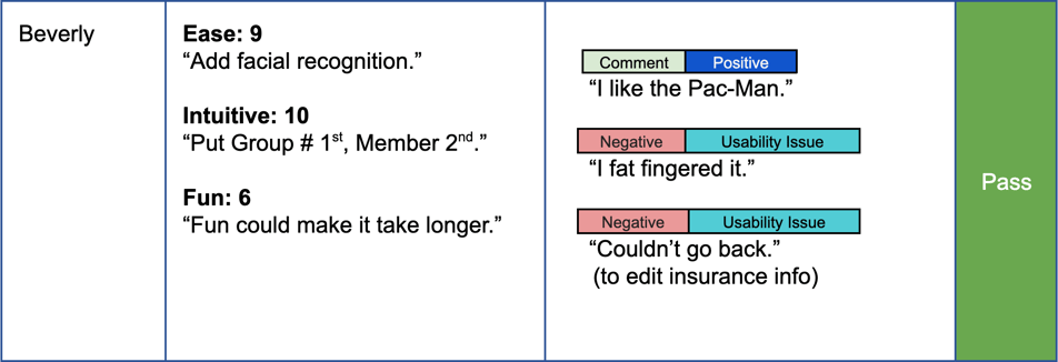
Test observations that map to user quotes, pictured here, provide greater depth of insight.
Back in 2012 Nielsen Norman Group suggested you only need 5 participants. After that, you start to see repeating results. This has proven true in our experience running scenario-based usability tests. With products that have multiple UI's, such as a SaaS application, you may need more participants to cover the spectrum of users for each UI.
If you are using software that does the analysis for you, then testing with larger groups is less daunting. However, even with the support of software tools to do the analysis, it is important to manually comb through the results and question the outcomes being suggested by a software tool.
Ultimately, analyzing and understanding human behavior is best done by humans. We recommend a utilizing a combination of the methods in this article with expert analysis by a user researcher to get the best results.
This article will walk you through 6 common methods of user testing to help you get started!

The 6 common methods of user testing we cover in this article include:
-
-
- Focus groups
- User interviews
- Surveys
- Heatmaps
- A/B testing
- Beta testing
-
Each has their pros and cons, and many can be used in conjunction with one another, or at different stages of the design process.
Focus groups involve sitting down with real users to discuss your product. These groups are generally small, about 12 people max, and mediated by someone on the design team. It may be useful to have one or two people mediating to ensure the discussion stays on topic. Focusing on specific aspects of your product helps to control the discussion and ensure you’re receiving the information that’s important to you.
User Interviews function similarly to focus groups, but are generally conducted with only one participant. You can conduct interviews where you just ask questions or you can have the participant walk through a specific process of your site and ask them about their experience and thoughts as they do so. Usually only a handful of interviews are required to generate useful data.
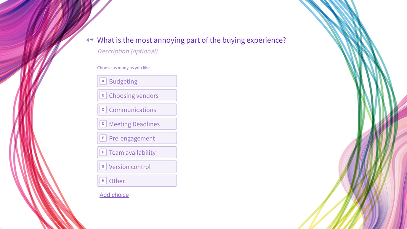
Surveys are another great feedback tool and can be completed faster than focus groups or interviews. These can be sent out using email lists, requests on your site/app, or on social media, and can reach a lot of people. Surveys have the capability to be as narrow or as broad as you want, it’s up to you!

User Survey we created using Typeform
Heatmaps show how users interact with your site/app. The areas with the more orange and red tones are the ones where users spent more time and the areas with greens and blues are where users spent less time. There are different types of heatmaps you can use depending on what information you want to know.
![]()
Here are just some of the maps that can be generated from user interaction data:
-
- Scroll maps show you how people scroll through your website/app. Areas that have a higher concentration of scrolling are seen more than those with a smaller concentration. This can be helpful in determining where to place important information and CTAs on your site or app.
- Click maps tell you where people are clicking or tapping on your site or app. This can give you insight into how people are using your product and whether you need to adjust the wording or placement of certain elements to make things clearer to users. They can also highlight rage clicks which tell you when a person is rapidly clicking and experiencing frustration.
- Move maps track where users move their mouse as they use your site. Research suggests a correlation between where someone’s mouse is located and their gaze. This means that move maps can indicate to you where people are looking. Like with the other heatmaps, this can help you make decisions about the placement and design of elements.
- Eye tracking helps uncover where users are actually looking at the screen. If you have the technology and are testing in-person, you can try eye-tracking as a means of learning where people are looking throughout an experience and couple it with a post-task survey to help you understand what caught their attention. This can inform you what images or calls-to-action are resonating or detracting from the experience, as well as how much or little a user is attending to the written content.
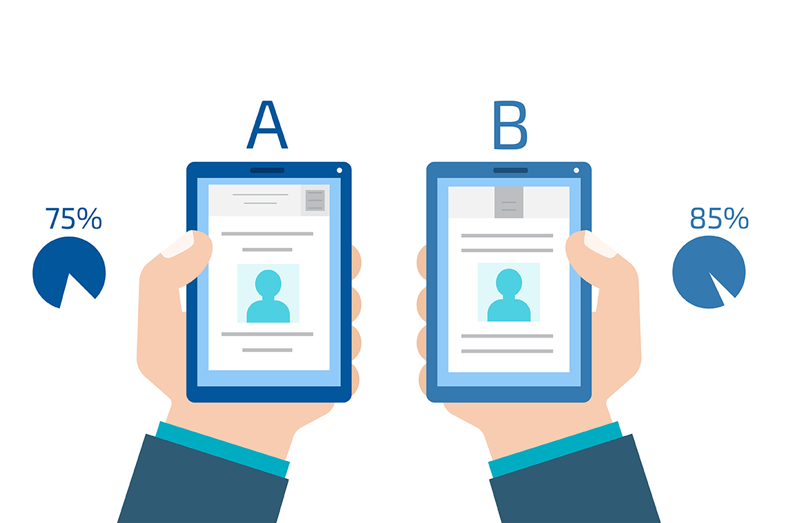
A/B tests involve splitting your participants into groups to test different variations of your site or app. You can do this manually when you recruit participants or you can set it up to where each user automatically sees a different variation of a screen. A benefit of A/B testing is that it allows you to test differences between design and UX choices to determine what gets users to take certain actions vs. just going off of personas.

Beta testing requires a working prototype and is generally done in the last stages of design. This allows you to test your finished product with a limited pool of people while still giving you room to make changes if necessary. Beta testing works best if you’ve done other user tests prior to this test, so you should already have an idea of what customers want and are now ready to iron out the kinks.


.jpg)