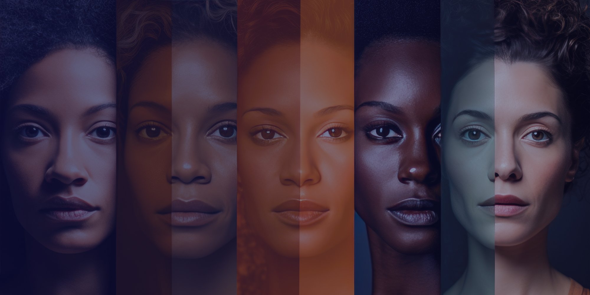
- Color has a big impact on mood and perception
- Check meaning when designing for international markets
- Palettes often look best when they are based in analogous or complementary colors, or in colors that already appear frequently in combination
Color is an integral component of UX/UI design. It can help set a mood, call user attention to a certain item, or act as brand recognition. But color in design is about more than just the colors and shades used, it’s about consistency, psychological effects, eye strain, and accessibility.
This article offers a brief overview in color theory and the psychological effects of color.
Color can have a big impact on perception, and the ways colors are combined or presented can alter user perception, even on similar sites.
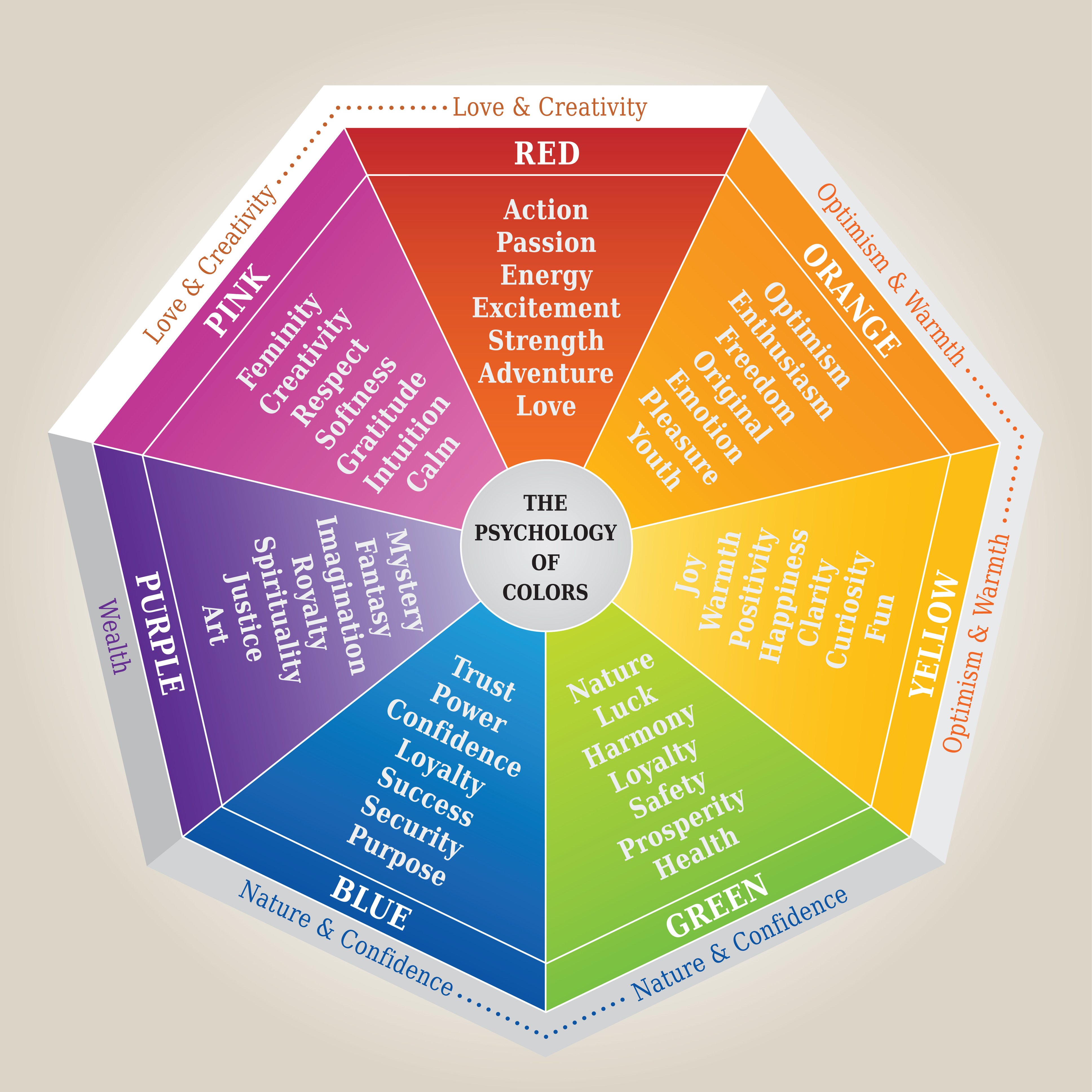
Understanding the psychology of color can better help you design for your goals:
Red is a strong color and can elicit reactions from people. It can represent passion or danger, but lightened to pink it can instead represent romanticism and femininity, and darkening it to maroon can impart a more traditional feel. Red can be a good color for call-to-actions
Orange is an energetic color that can call back to adventure, youth, and creativity. It’s also tied to the 1970s and can be used to create a retro feel!
Yellow is considered to be happy, cheerful, and optimistic. Pastel hues of yellow can be used for soft backgrounds, whereas brighter yellows can be callout colors or to express creativity. Darker yellows can come across as gold, which suggests wealth or success—but be careful when darkening not to muddy the yellow!
Green is pretty universally connected to nature, and thus can represent renewal, growth, and sustainability. Dark green can represent money, prosperity, and stability. Like red, green can be a good color for call-to-actions, but it can also serve as a good main color for your site too.
Blue is a calm color that can be relaxing and can signal intelligence. Lighter blues tend to be viewed as more peaceful while darker blues are seen as more powerful. Blue is a common brand color for websites and companies, such as Facebook, LinkedIn, IBM, and Paypal.
Purple has historically been linked to royalty, wealth, and luxury as well as mysticism and spirituality. It can also evoke creativity. Like green, purple can act as a good callout or background color, depending on the shade you choose.
Black is another color that is associated with power and elegance. It can also be used to create a mysterious or cool look. Black can make things look more sleek and can impart both modernity and timelessness. It’s also a neutral color that works well with other colors, in typography, and as a grounding element in design.
White can be seen as minimalist or innocent. As another neutral color, there’s a lot you can do with white in your design, and pairing it with other colors can compound their effects to create the exact look you want.
Gray can have many different meanings, ranging from serious to sophisticated to conventional. For some, it represents formality and dependability. Like with the other neutral colors, it can provide a centering element in your design.
Brown is another color associated with nature. It can be seen as warm, friendly, and outdoorsy. You can use brown to play up the idea of warmth or wholesomeness, pair it with green for an ecofriendly feel, or use it to create a sense of heritage and tradition.
These color meanings can help you get started with your design. Keep in mind though that these are subjective, and it’s always a good idea to check the meaning of a color if you’re designing for a multi- or international market.
As a designer, you might be working with a preset palette determined by the client, but other times you may need to create a palette yourself. In these cases, there are some quick tips that can help you get started.
Palettes often look best when they are based in analogous or complementary colors, or in colors that already appear frequently in combination. Analogous colors are ones that appear next to each other on the color wheel, such as blue, purple, and pink. Complementary colors are ones that appear across from each other on the color wheel, like pink and teal or green and purple. Colors that appear frequently together could be things like natural colors (green, yellow, brown, etc.) or they could be common theme colors (blue, yellow, pink; black, white, and red, etc.).
Definitely play around and see what works best visually and for your product!